
Goals:
Increase website visitor's awareness of the products being sold. The website receives countless users from social networks and search engines (SEO and SEM). However, few visitors click to visit the product catalogue and courses page.
168% more visitors landed on the catalogue and course pages after simplifying the website's structure, making information clearer and reducing the clutter.
My role:
- Digital analytics;
- User Flow definition;
- Questionnaire elaboration;
- User Stories elaboration;
- Personas development;
- UI creation;
- Developing functional prototypes;
- Remote Usability Test.
Tools applied:
- InVision;
- Hotjar;
- Google Analytics;
- Google forms;
- Figma;
- Camptasia;
- Adobe Illustrator;
- RealtimeBoard;
- Userforge;
- WordPress;
- Elementor;
- Html, CSS and JavaScript
Research and Data Analysis
What UX changes should be made to make visitors interested in the existing products and catalogue page? Before any UX proposals, I had to understand how users were using the website, who they were, what they clicked on, what problems they were facing, what their goals were, and what they did the most when browsing it. To find these out, some research techniques were selected considering available time and cost:
- Digital analytics;
- Click map;
- Scrollmap;
- Screen recording;
- Questionnaires;
- Submitted doubts through contact channels;
- Page speed analysis;
- Desktop and Mobile browsers testing;
- Heuristic Analysis.
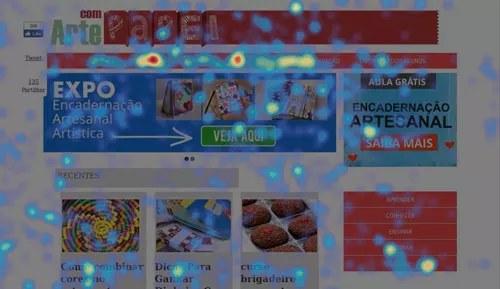
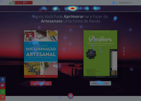
I started with a heuristic analysis. It allowed me to identify potential problems quickly (I’ll describe those soon). That analysis helped me to understand which elements were causing friction and distracting visitors—all corroborated by other methods, such as click maps, digital analytics, etc. Some of the problems I have detected:
- The value proposition was unclear;
- Cluttered interfaces were increasing cognitive load;
- Lack of a visual hierarchy;
- Important links were below the fold;
- Difficulty in identifying existing products and courses on the website.
During data analysis, performed with Google Analytics, I found that 51% of organic visits were from mobile users. Android was the second most used system. So I performed various functional tests on various devices, along with heatmap and screen recording analysis. Usability and functionality problems were also detected in this phase, which hindered the user’s optimal flow because of a myriad of problems, such as banners covering important text on the page.
In this phase, I also noticed that 4% of visitors accessed the product pages using 320×568 screens, and their conversion rate was lower than those of different resolutions. The reason behind it was not discovered. More thorough research is needed to understand this behaviour.
Taking into account the whole website traffic, Google Analytics reports showed that the most popular operational system was Windows. Some browser limitations were also affecting sales. I’ve noticed that Internet Explorer 8 had big trouble rendering a CSS style. That made some above-the-fold texts not legible on important product pages.
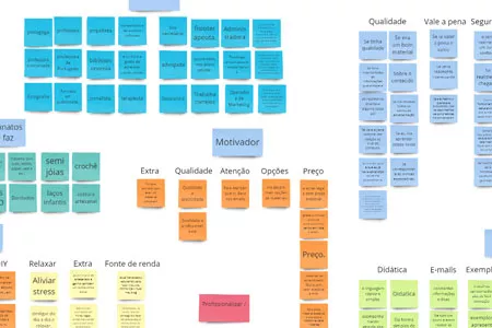
Analyses were also performed on the main website entry pages, and the flow users were going through. This allowed me to elaborate on strategies to increase users' awareness of available products. I also used questionnaires to better understand users’ needs, objectives and problems they faced before making a purchase. The results allowed me to make an affinity diagram to detect patterns, which allowed me to create personas that guided the development of the solution.
To end the analysis phase, I prioritised the problems using an Ice Score framework. That enabled me to focus on pages that presented higher conversion potential with reduced cost and effort. The prioritized pages were the home page and product catalogue.
Ideas generation and prototypes
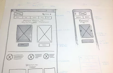
Using the insights from the research phase, several sketches were created demonstrating possible solutions. I selected the one that presented the highest potential and that followed the best practices known in the market, which are supported by professionals like Jakob Nielsen, Pep Laya, etc.
The following step was to develop prototypes to perform remote user tests. (I’ll talk about that in the next topic). The tested prototype presented the following characteristics:
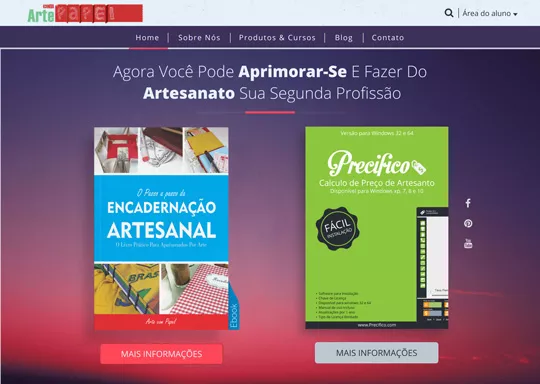
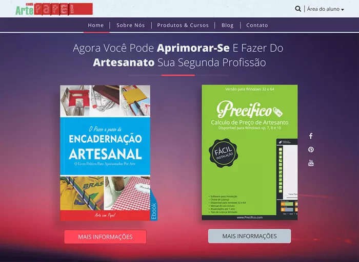
- The photo of the two main products was above the fold, on desktop and mobile. Both images were clickable and led users to the detail page;
- Most visitors were above 45 years old and were not tech-savvy. Thus, buttons had volume and shadow to make it more prominent and intuitive to them;
- The product catalogue link located on the navigation bar was centred. Also, the commercial “and” (&) was used to give it more visual prominence on all pages, including in blog articles itself;
- Client reviews were added in a visible section of the home page to provide a higher sense of safety and trust to new visitors;
- A new utility link, dedicated only to clients, was added because research revealed that clients visited the website looking for such links;
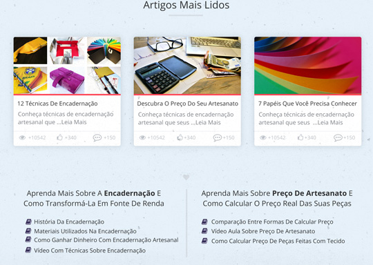
- An Article area was added to instruct visitors about presented opportunities;
- A grid view was created on the product catalogue page to display images of the products with visible prices, helping visitors quickly pick the ones within their budget;
- A sidebar with filters was created on the catalogue page to make the search easier and give users an overview of what is (not) available on the website;
- Social media buttons were repositioned to avoid hindering user experience, either in mobile and desktop users.
I developed prototypes using Figma to test the new proposal with users. We wanted to receive valuable feedback, so I created high-fidelity prototypes to be able to evaluate users' first impressions.
User tests and iterations
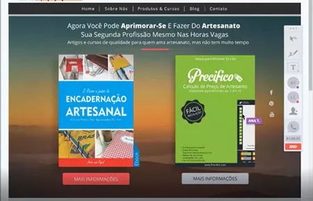
I performed user testing using the Figma prototype and InVision. The whole study was recorded for later analysis. I wanted to test the main flow where each user would search for the ideal courses and, also, evaluate the level of trust and emotional response they had from interacting with the home page for the first time.
The chosen users were recruited based on the similarity to the personas I had already identified e.g., enjoy doing handcrafts. These tests allowed me to identify several problems that I could tackle before implementation:
- The pages had a high level of trust, but most users thought the colors were too sober;
- The first contact—of 5 seconds—wasn’t enough to make some users remember what the website was about;
- On the catalogue page, some people had problems deactivating the filter to see the whole catalogue again.
Many changes were made due to the feedback, among those:
- A new colour palette;
- The headline went from 15 to 12 words, the main words were highlighted, and the subheadline was removed;
- I increased the overall whitespace and adjusted the hierarchy so that the users could see important information more clearly;
- I improved the filter option. So, it would hide all unwanted products, leaving a “remove filter” button right below the catalogue.
A new interface was designed after this so that new tests could be made.
Results
168% more visitors could reach the client's main pages after simplifying the website's structure, making information clearer and reducing the clutter. Starting from the home page, 6% more users visited the main products’ sales pages. Twice the amount of people preferred to click on the images as opposed to buttons. As a negative effect, 16% more people exited the website from the home page (we expected to reduce it to 5%).